Sir Andrew Strauss’ review into how to improve the performance of men’s international and domestic cricket is nearing its end, and has released its consultation document to the public. This unusual transparency from the ECB allows us to consider data given to county chiefs before they vote on the issue, and also gives us an insight into the current decision-making process within English cricket.
The actual report itself was written by consultants Twenty First Group, who call themselves a “Sports Intelligence Agency” (I assume this is an allusion to the Central Intelligence Agency, although I cannot fathom how that would be a helpful comparison), with input from a panel of experts across cricket, other sports, and business.
This appears at first glance to be very open, transparent and collaborative, particularly compared to the ECB’s usual modus operandi. However, it should be pointed out that various tricks have been used to direct readers to what you might assume to be the authors’ preferred outcomes.
People Only Read The Title
One very simple trick is just to use the title or description to state the point you want to make, even if the evidence doesn’t necessarily support it. Take this, the first page of evidence in the review:
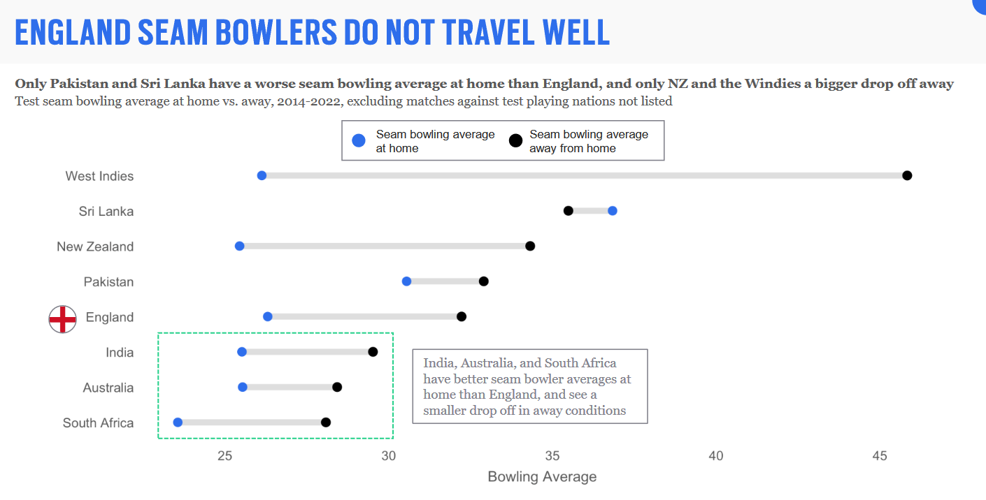
Now look at just the location of the black dots. According to this graph (and confirmed by a quick check on Statsguru), England have the fourth-best seam unit away from home. They travel better than New Zealand or Pakistan, for example, who both have the reputation of being very good pace attacks. If this graph was presented without comment, what would someone take from it?
I can easily explain why the difference is so great between England’s home and away bowling averages in two words: Chris Woakes. Despite having a very poor record away from home, he has played in 20 Tests abroad (The 4th most amongst English pace bowlers behind Anderson, Broad and Stokes) since 2014. He averages 51.88. No rational person would select him, and even Ed Smith would find it a stretch. The reason he has played so many games in conditions that don’t suit him is because there was often no alternative. Everyone above him on the ‘Test bowlers suited for bowling on a flat/dry pitch with an unresponsive ball’ list was injured. In the same period, Mark Wood, Jofra Archer and Olly Stone combined have played in 19 Tests. It’s not that England don’t have pace bowlers capable of thriving in foreign conditions, it’s that they are almost always unavailable due to injury.
By happenstance, one of the High Performance Review panel members is ECB Performance Director Mo Bobat. His job for the last three years has been to oversee the fitness of England players, the bridging between county and international cricket through the Lions and other development programmes, and the Loughborough academy. If talented cricketers are spending more time on the physio table than on the pitch, you could argue that he is the one to blame.
Too Specific
One trick the ECB likes to use, as I have covered in two previous posts regarding The Hundred (HERE and HERE), is showing very specific statistics but using it to present a broader point which the data doesn’t support.
Take this chart, for example:
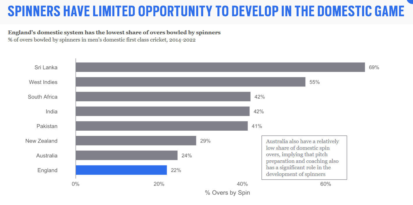
On the face of it, this looks terrible. Spinners get fewer domestic opportunities in England than the other 8 cricket boards, so how can the England team be expected to develop spinners who can prosper in Asia? Except that this isn’t what this chart actually shows. Instead of (for example) total spin overs bowled, it is a percentage of total overs. To answer why the panel chose this specific measure to illustrate their point, consider this chart:
Framing
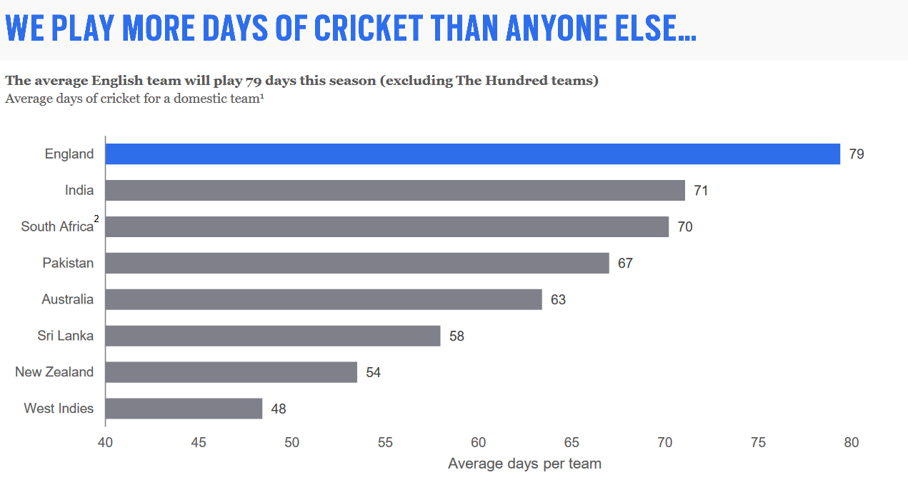
It is very simple to alter the appearance of a graph in order to accentuate differences between figures. All you have to do is start the numerical axis at a number other than 0. Here’s one example:
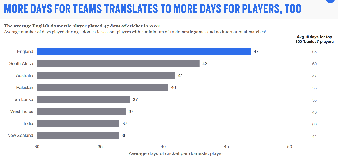
Notice how the chart begins at 30 rather than 0 days. This means that the shortest bar is 6 days whilst the longest (England) is 17 days. To a casual observer, it would seem like England played almost three times as much cricket as New Zealand and India. To compare, here is what the chart would look like if it began at 0:

Seen at this scale, the differences between countries seem far less pronounced. English players play 30% more days than those from India or New Zealand according to this data, or 10% more than in South Africa. It suddenly becomes a less obvious factor for why English players might underperform.
Another related trick you can use is taking advantage of the page orientation to maximise or minimise the variation in a chart. Take this example:
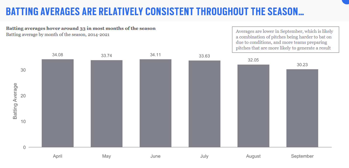
As well as beginning at 0 and having a title which calls the averages “consistent”, it is also one of just two bar charts in the report which the bars are vertical rather than horizontal. On pages or screens in landscape orientation, vertical bars are shorter than horizontal ones due to a lack of space. This reduces the apparent differences between two bars even more than before. Here is the same data, but presented as a horizontal bar chart and a shortened X-axis (most other charts in the report are shown this way):
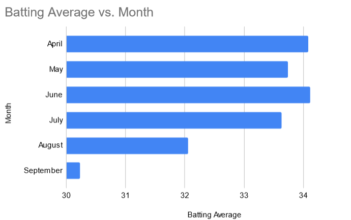
All of a sudden, you would face an argument that first-class cricket cannot be held in August or September. Considering that the rumours are that this (and April/May) is the panel’s favoured time for the Championship to be played, you can see why they made their style choices.
Read The Fine Print
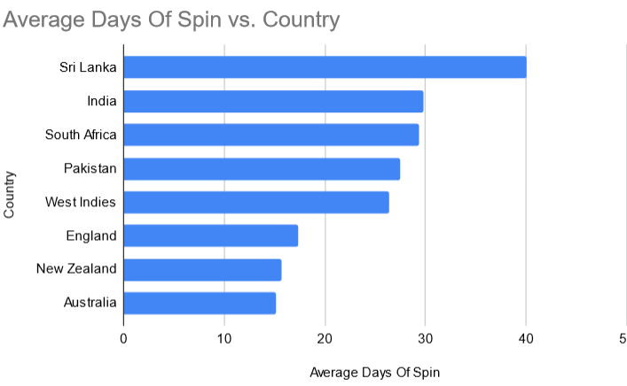
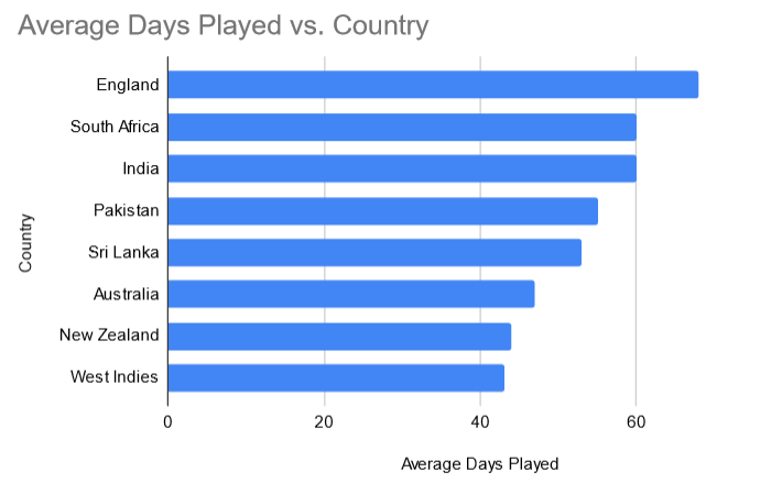
If there is some data which you want to include for completeness (or perhaps to cover your arse, so you can prove you told someone at a later date) but it doesn’t support your argument, you can just hide it using formatting or perhaps hidden in an appendix. If we take another look at the first graph from the previous section, you can see a set of figures written in grey to the right of the chart:

If you put these numbers in a chart, it looks like this:
Conclusion
I found myself utterly unimpressed with the outcome of this review. It’s light on detail and has very little in terms of actual recommendations from the panel itself. Instead, it largely seeks to ask the counties which changes they would make based on the information provided. Although the various manipulations which I have detailed above might point the counties towards certain proposals (fewer matches with greater rest, red ball games during The Hundred, a smaller Division 1), the actual suggestions from the panel are small and largely meaningless.
The one which makes me genuinely angry is ‘Understanding What It Takes To Win (WITTW)’. It say the ECB should “research into WITTW (red + white ball)” in order to produce a “Definitive WITTW report”. Maybe I was being naive, but I thought that was what the High Performance Review was supposed to come up with. Why would you have business leaders and people from other sports on the panel, including famed ‘win at almost any cost’ advocate Dave Brailsford, if not to provide an expert insight into how to succeed? I have to assume that this panel was not cheap to assemble, nor the consultancy firm who collated the report, and yet one of its key recommendations is that you should assemble another panel (and perhaps the same consultants) to answer the question that was basically the whole point of the original exercise? What utter nonsense. But nice work if you can get it.
There are three massive elephants in the room which the report has totally ignored. One is The Hundred. It is hand-waved through with the rather optimistic description of “The Hundred is committed through to 2028, and is a clear best vs. best competition”. How they square “best vs best” with the existence of Welsh Fire as a team is frankly beyond me. The Hundred apparently exists as a giant monolith in the middle of the English season, around which everything else has to fit. The cricket calendar in 2019 was far from perfect, but even the tournament’s biggest fans can’t deny that the domestic schedule is even worse now. The Hundred does aid the development of English cricketers, but almost exclusively towards entering other T20 leagues around the world rather than playing for England.
The second is the county youth system. Development of players ultimately depends on counties hiring those with the potential to play at international level, and it’s not clear that this is currently happening. I’ve written previously about how counties often seem to ignore talented youngsters if their face doesn’t fit or they can’t afford to fund their own training. You can see the almost immediate success of the ACE Programme and the South Asian Cricket Academy in identifying multiple cricketers outside the county system who are arguably better than those currently with contracts as evidence of this. Comparing schedules between countries does not matter if English clubs aren’t capable of identifying the best players available.
The third is how players improve (or don’t) whilst under the direct care of the ECB. It is a tale as old as time: A promising player has a breakout season in county cricket, gets called up to play for England, or a training camp at Loughborough. They start well, but over time their form declines. If they’re a batter, it’s usually their technique which is changed by the specialist coaches into a mess of neuroses where they now can’t keep out a delivery bowled by a twelve year old. They re-enter county cricket as a broken husk of a human being, and are never heard from again. If they’re a bowler, they are typically transformed from a colossus who bowls 90mph thunderbolts to someone with the skeletal structure of a 90 year old with osteoporosis who has trouble tieing his shoelaces. Ironically, this often occurs because the coaches want to alter the bowling action to ‘prevent injuries’. A lucky few become T20 specialists, more or less able to handle 4 overs every few days. Those less fortunate are chucked in a pile behind the bike sheds at ECB’s training centre in Loughborough.
All in all, the report is almost entirely without merit. How it took three months or more to come to this point when the data used in the charts would take an A Level Statistics student about a day to compile and the resulting ‘evidence’ is a mess of conflicting numbers which don’t really suggest any clear ‘solution’ to the problems at hand. As worthless a use of time and money as I can imagine, in all honesty. A fitting tribute to the end of the Tom Harrison era at the ECB.
If you have any comments about the post, England’s Test win, or anything else, please leave them below.
